Color
Learn about the moods that colors convey and how to use a color palette – and snag a few professional palettes for your own use!
Convey the right mood
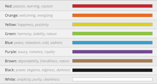
Colors stir up emotions. Red can be used to make something more passionate, but can also be alarming. Black can be used to add elegance, but can also be used to convey darkness or evil.
The chart to the right shows some common color and mood relationships to keep in mind as you design.
Color and mood relationships

Using a color palette
A color palette is a set of colors that work well together. A palette composed of three to five colors will suffice for most projects.
One of the most important aspects of a good color palette is contrast. For instance, background and text colors need strong contrast for easy reading. Additionally, colors should “feel” good together.
It’s good practice to use color consistently throughout your design. For instance, your background, heading, sub-heading, and body text colors will almost always benefit from staying the same color (and size) across your project.
Breaking out of your color palette should be done carefully and only where the break supports the content. For example, you might try using your original palette in a different way for different sections of a longer presentation.
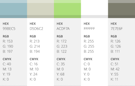
Examples of good color palettes


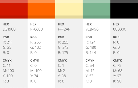
Examples of bad color palettes


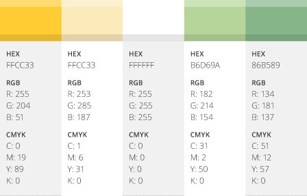
Optional color palettes
We’ve put these palettes together to get you started – enjoy!


