Layout
Learn how things like text size, text alignment, background design, and white space affect the presentation of your content.
Text size
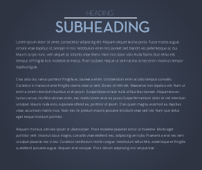
Text size, or volume, communicates the role the text plays in the content. For instance, it’s common for headings to be larger or more bold than their body-copy counterparts.
Make sure that your headers stand out from your body copy, and that the body copy is big enough to read without straining your eyes.
Good example of text volume
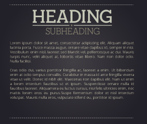
Bad example of text volume
Text alignment
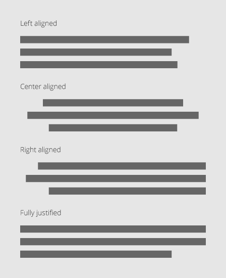
Text alignment, or justification, can effect how easy it is to read your content, and can lend visual consistency to your text. There are a few different ways to align your text and it’s important to know the differences.
Most readers are used to reading text from top to bottom, left to right. This is why almost all text is left-aligned; when you finish the text on the first line, it’s easy to find where the second line starts.
Center-aligned text is harder to read quickly. When we finish the first line of text, we have to hunt for the start of the second line as it isn’t right under where we started. Center-aligned text can be useful for captions under content.
Right-aligned text is usually used when your design centers around the right side of the page. This is rare and should be used only when necessary.
You may find it necessary to fully-justify your text, which means to align it to both the left and right sides of the paragraph block. This may look nice in some situations, but can cause unsightly spacing differences between words.
Choosing an appropriate background
Most backgrounds are either graphically created, such as a gradient or a solid color, or are photographs. They key to either is to use a clean and simple image that is not distracting.
Solid color backgrounds are usually best because they are least distracting. It’s also usually easier to read text off of a clean background than a photographic background.
Photo backgrounds tend to be busy and, as a result, distracting for the audience. However, photo backgrounds can be used very effectively to further communicate a topic, provided that any text is placed over negative space in the image.
Good example of a photo background

Good example of a graphic background

Bad example of a photo background

Bad example of a graphic background

Aligning graphic elements
Alignment refers to positioning your graphic and text elements relative to each other and to the design as a whole. The goal of the alignment process is to help create attractive, readable pages.
Most designs contain multiple graphic and text elements, and these should be aligned with one another. Otherwise, designs tend to look cluttered and unorganized.
White space
White space, or negative space, is any area of the design that does not contain text or graphic elements. This allows breathing room between the ideas presented in your design.
Too little white space will make a design feel cluttered and overwhelming, while too much can make it feel incomplete.
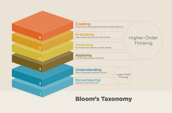
Good use of white space
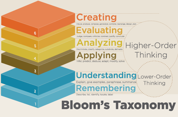
Bad use of white space
Grid layouts
Advanced users sometimes develop grid layouts for their work. A grid defines an overall structure for the placement of content and includes areas designated as white space. Thinking With Type provides a detailed explanation of designing with grid layouts.
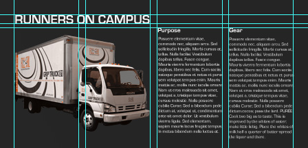
Layout utilizing a grid layout
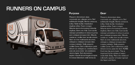
Layout with grid on
