Typography
How your text looks affects how your audience reads it. These typography basics make it easier for your audience to get your message.
Serif and sans-serif fonts
The are two kinds of fonts; those with serifs and those without.
Serif fonts, including Times New Roman and Georgia, have small flourishes at the terminal points of each letter. These help guide your eye as you read in large bodies of text, making it easier to read.
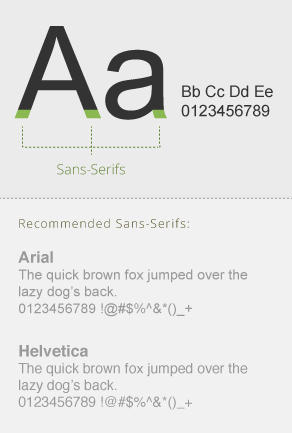
A sans-serif font like Helvetica or Arial doesn’t include these structures. These fonts usually appear cleaner and are considered more modern. They are commonly used for body copy in on-screen material.
Serif

Sans-Serif

Using the right fonts
Fonts are the backbone of great typography. Using the right font at the right time can help you communicate your message. On the other hand, using the wrong font can distract your viewer and make your project look amateur.
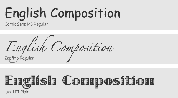
Avoid fonts that look “cute” or “fun” unless there is a specific need. For example, Comic Sans has a childish appearance, and is not appropriate in a professional, university-level education environment. However, if you need to create a “Lemonade – 50¢” graphic as part of a presentation, Comic Sans would be an appropriate choice.
Good font usage

Bad font usage

Leading
The space between your lines of text can be called white space or ‘leading’. There needs to be enough space between each line so that the text is comfortable to read.
A good rule of thumb is to set your leading slightly greater than the size of your font.
Kerning
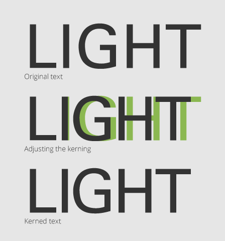
Kerning is the process of adjusting the spacing between type characters.
Letters that are too tightly kerned can make the text feel cluttered and claustrophobic. Letters that are too loosely kerned will make a word look disconnected. Both are distracting for the reader.
Large text, including titles, almost always needs to be kerned, because the space between each letter is more obvious as the size increases.
Kerning in Adobe Creative Suite Applications
- Place your text cursor between two type characters.
- Hold the ‘Option’ key and press the ‘Left’ or “Right’ arrow to decrease or increase the type spacing.
To kern an entire block of text, select all of the text and use the ‘Option+Arrow Keys’ method.

